Data Visualization Group Activity
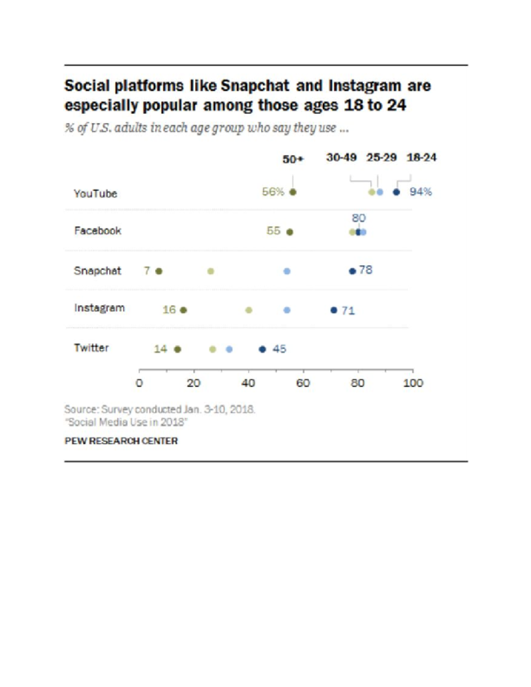
Task: Give students data in different forms (graphs, words, pictures, etc.) and allow them to work in groups (3-4 students) to come up with ways to make their data visually pleasing. Have students present their work and explain why they chose to present their information in the way they chose. Each group of students will have a different topic that is relevant to current issues in public health. Allow the entire group to share 1 “glow” (something the group did well) and one “grow” (things the group could have done differently).
Discussion:
Where do you usually see information/data?
What are some qualities you have noticed about the way information is presented today?/ Why choose to display information in the form of an infographic? (Listen for ideas such as being easy to read, reaching out to many audiences, and being creative)
Explain the impact of adding art to information.
It saves people time from having to read the information / gets the message across more quickly.
Some people are visual learners.
Helps to gain an audience and engage the audience.
Visual representations of data always present a goal or idea.
Social media and widespread viewing.
As you create create your visual representations of the information provided, think about the following:
Simplicity
Spacing and Formatting
Symbols and Imagery
Audience
-
Creativity
Topics:
Health Equity
Gun Violence
Homelessness and Heat Illness
Mental Health on College Campuses
Physical Activity and Nutrition
Created For
K-12 EducatorK-12 Student
Museum Visitor
UMMA Docent
UMMA Staff
University Faculty
University Student
Rate this Resource
AVG: 0 | Ratings: 0
& Author Notes
All Rights ReservedLast Updated
July 25, 2018 10:16 a.m.Report
Reporting Policy


